Friday, July 27, 2012

Laid-Back Boys Room: Adding Some Beachy Details

I have had these old boat oars sitting in our garage FOREVER. They are actually from our old boat. I knew I would eventually use them for something, I just didn't know when/what. And when our youngest picked out this picture for his new bedroom, I knew I would add them to his room.


We found this painting at Garden Ridge and it became the entire inspiration for his Boys Surfer Room.  Its HUGE. I can't wait to get it put up in his room. Though he has also started asking for some rock-n-roll stuff to be added as well. Not sure how that is all going to tie in together.

In the mean time, I have been working on some beach related details for his room, including the oars!


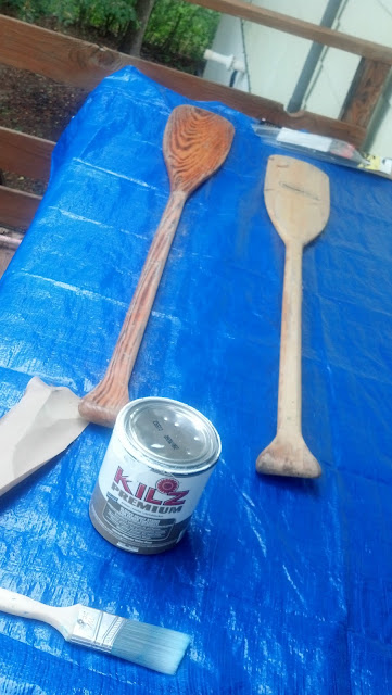
Here they are in their natural state...not much to look at!

I used some Kilz Primer, and it actually seemed to work against me in the end. It made the distressing part very difficult. After the primer, I used just a base white flat paint I had in the garage. 


Then, I picked thru various colors and settled on an aqua/green combo and aqua/yellow combo. I used a little red to add some fun personalized details for my son.

I just randomly started painting stripes, sporadically down the oar. I free handed the lines and didn't worry about getting anything perfect because I knew I would be distressing them. I started with my green and then added the aqua color.


From this point on I quit taking progress shots. I was working on these outside in between various storms that we had throughout the weekend. The second oar was finished along the same plan. Random stripes painted on the oar. 

And now its time for some finished shots;


They are just sitting in my son's now packed up room. They do not exactly match the pinky beige walls, but its the best at this moment. 


He choose the number 5, because that is how old he is right now. I also add his initials, RP.


They are so awesome! I love how they turned out. I think they will add fun details to his room along with some pops of color on his walls. I have not decided how I will use them just yet, but I thought maybe using them as curtain rods. Though, a good portion of them would be covered up, so I may mount them in the space above the curtain rod instead. 

The move is only days away. We are so excited to get in, do some painting then start moving our stuff in! The boys are very excited about their rooms. 

So, what do you think of the oars? 

Linking Up to the Following Parties:

Thursday, July 19, 2012

Refinishing Old Table into Outdoor Patio Table

When we moved almost two years ago, a family member gave us an old Ethan Allan trestle table and 6 six chairs. The table was solid but in rough shape. The top had HUGE gouges all the way across. The chairs had been trimmed shorter, but were oddly low when you sat in them. They didn't last very long before they started falling apart. 

We tossed the chairs, put the table in the basement and bought a new dining set. Then I sanded the table and painted it for outdoor use. Then it sat on the back deck, unused for at least a year. 

This is what it looked like a couple days ago, after I cleaned it off:


The legs are my favorite part of the table. I am leaning towards leaving the bottom half painted. I will keep the white paint for now, but may change to a different color for an added pop of color once we get settled in and the whole area starts to come together. 

The sealer I used turned the white paint an ugly yellowish color. There were rust spots in various areas of the table, and a stray cat has been living underneath the table for a while. 

But it has potential! And instead of building a new table, like I discussed here, I decided to try reusing our current table.The idea of a refinishing a table for outdoor use has been something I have wanted to try for awhile. I hope through refinishing the old dining table I will achieve that timeless, worn look. A table that has been around for generations.

So yesterday, I cleaned it off and started with a quick sanding, followed by a layer of Citristrip Stripping Gel.  I worked in sections because of the extreme heat. But it still didn't take me too long. 


After the first layer of gel was removed from table, I started to see the potential of a fun farmhouse style table that would be perfect on the new patio at the new house.


I started sanding the table, but realized the first layer of stripping gel only removed the paint. The shiny finish of the original table treatment was still intact. So I spread another layer of gel across the top and sides again. 


As I started to removed the second layer of gel, I really noticed the nice wood grain and warm color of the natural wood. 


For the next couple of hours I sanded! First, I wiped the entire table down with a bleach cleaning solution to make sure I had all the stripping gel was removed. Then I started with 60 grit sandpaper. Next I used 100 grit, then 150 grit and then I finished up with a super smooth 220 girt sanding. With the final sanding I went very slow, along the wood grain. I focused on all the areas with imperfections like those below:


So for a day and a half of work, I finished up tonight and its looking like this:


I LOVE the table! It looks so much better than I had even hoped. The top still has lots of imperfections, and I may have used my sander against the grain in some areas, but I think it just adds to the character. 


I have not decided on what type of stain I am adding, if any at all. I will need to re-seal the table to protect against moisture and everyday use, but I am loving the soft natural wood look with the white legs. If I do actually use stain, it will be something that just adds a richer tone to the natural wood. Whatever I do, I want to avoid anything that will give it an orange tone. 

Tomorrow I will follow up with a proper staging of the table. But for now my back says its time to relax! 

If anyone has any suggestion on what to seal the table with or an idea for stain I would love to hear from you! 

Linking Up To:

Fabulously Creative Friday
Transformation Thursday @ The Shabby Creek Cottage 
Primp 
Furniture Feature Friday's - Miss Mustard Seed
Cowgirl Up! The Farmhouse Porch

Wednesday, July 18, 2012

Outdoor Table: Refinishing an Old Kitchen Table

I have an old dining table that I have refinished once before, but the table just sat at the back of our rental house. Our yard isn't very usable in the back and the deck space was too small to really eat outside.

At the new house, we have a huge covered patio area off the kitchen/living room area. The table is an old Ethan Allen trestle table. The chairs fell apart and we got rid of them awhile back. I am thinking that for now I will create a bench and essentially create us a picnic table. 


I really like the Providence Bench (above) from Ana White and Brook at Being Brook. But I will probably stick with the the Simple Outdoor Bench (below) from Ana as well. The simple bench will look nice with the simple trestle table. 


Combining a simple bench with these Silver Tabouret Stacking Chairs from Overstock.com. They are stunning! The reviews are awesome and they add such an industrial feel. 

I will probably go with the silver finish! But there are also red, white and black. The red is very appealing too. They are a vibrant, shiny red. Jessie at Cape27 posted a great photo of their red chairs with their Ikea outdoor dining table.


But first things first, refinishing the table. I painted the table about 2 years ago. But I think I will leave the base/legs of the table a warm white and then sand, strip and re-stain the table top. I am loving Minwax Ebony color right now, and that will tie the dining in with my Outdoor Chaise Loungers

Slowly I am starting to see things coming together in my mind. With some previous purchases, and re-purposing some already owned things, I think I will have my patio space good to go soon after moving. I can't wait to have our first cookout! 


Tuesday, July 17, 2012

Master Bedroom Inspiration: Dark Walls?

What are your thoughts on dark walls for a Master Bedroom. I was thinking something calm and soothing, with light walls and white bedding...

Until I saw this---


This room blew me away! I never thought I would like a room with dark walls, but I love how the rest of the room pops. The overall style is stunning but not what I am thinking, but it was my inspiration to begin a search of dark and dramatic master bedrooms. I found the following rooms to act as additional inspiration.


I love softer look of the coral with white bedding. So fresh and cheerful. I wonder what an even darker wall might look like with the coral!


I love the pop of blue at the end of the bed, and the dark walls and curtains. I am crazy about the zebra pillows. I am now really liking the coral in the photo above and picture this bed with a couple coral pillows tossed in the mix. 


There isn't anything I don't like about this room. The pink softens the dark walls and the rug and pillows add some modern zing! 


This room is perfection! Its rich, and luxurious. The color on the walls is still "soft" and the pink pops give the room some excitement.  


I have never actually decorated my master bedroom. It has always been the catchall and dumping ground. But I am making a commitment to create a realistic and inviting room. Since I am leaning towards lighter greys throughout the rest of the house, I am thinking something different in the master. Something unexpected and with a wow factor! 

A nice diy'ed upholstered headboard with a fun fabric would help create the perfect color palate. A simple square headboard! 

So, this is my inspiration so far for the master bedroom. The days are dwindling quickly and packing is starting take off. Not something I am enjoying. I would rather spend my time looking for inspiration photos!


Tuesday, July 10, 2012

Easy DIY Outdoor Lounge Chairs & Pinterest Challenge: Summer Edition

Less than one month before we move! In an attempt to avoid packing I decided to start a couple outdoor projects. I have been stalking a few ideas on Pinterest for awhile now.

The first project is Ana White's $35 Chaise Lounges. Such a simple and comfortable looking chair. I know exactly where we can put them!

I have been going back and forth on what to put on our second level deck. I wanted to create a space that is relaxing and comfortable. I don't see us using the upper level with cookouts or gatherings, so my focus wasn't on multiple seating, just a space for us or overnight guest to use.  


Following the plans Ana White created and the advice of Brook at Being Brook who helped test of the plans!


The plans are very easy to follow and Brook provides additional tips and tricks as well.

With such detailed plans already created by the professionals, I just took a couple process shots of the building process. 


I wanted to see if everything was going to fit, before I started nailing and screwing everything in. I attached my 1x3 slats on with nails. I just used two nails on each end of each slat. 


When you look at the back end of my first chair, you may notice that mine looks different. I first was following the plans exactly. Then, once I got the legs attached and sat it upright something was very off. The back left and right front legs were not even. After measuring and trying a couple tricks I determined that the long 85" frame board warped after I started building. It was about 106' outside and I moved in and out of the garage as I was building. 


I tried to fix the problem but ultimately I was going to have to create new legs, but before I could do that I decided to cut off about 4" of the back, which included the first set of back legs, and the support piece of the frame. 


Then I cut a new 21" support frame, and 14" legs. Using clamps, I attached the legs and adjusted until I was sure the chair was sitting level. I ended up having to adjust the back left leg about an inch and half. If you look in the picture above you will see the small gap, where the leg is not flush with the corner of the frame. 


With the changes to the chair, I finished building and created my notches. I used a circular saw to create tiny slivers of cuts and then took my jig saw to trim the slivers out! It was the easiest method but killer on the back to hunch of over for so long.


I also made another change! My husband is a big guy and as I was maneuvering the chair around, I felt like the notches weakened the stability of the chair. So again, when you look at the back of the chair you will notice an extra 21" board placed near the chair legs. It added a ton of extra support! 

I should NOTE: with the extra changes I made, the chair no longer as the ability to lie flat. The shortened body frame and extra support board, no longer allow the the chair back to tuck into the frame. This does not bother us, but may limit the chair for some people. 


I also decided to trim the slats of the chair back flush with the frame and cushion top. I just took my circular saw and zipped right along the frame edge! 

Next step I sanded the whole thing smooth! Once that was finished I used the leaf blower to blow all the dust off, wiped it down with a towel and began staining in Minwax Ebony!


 Here it is drying with the staining completed. Next time I will stain before I put this together! 


And the finished product with its new green cushion from World Market, on sale, 50% off! 


So, there is chair #1. I still need to make a second chair, so it has a friend! It cost me about $45 without the cushion because of the mistakes I made and needing to purchase more wood. Totally worth every penny in my opinion! Its super sturdy and solid. 

Would to hear your thoughts and ideas! 

I am linking up with the following girls for the: 

Pinterest Challenge: Summer Edition